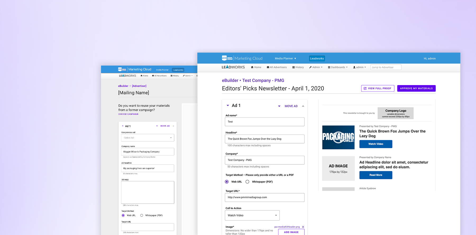
eBuilder
A material submissions tool created in the name of enterprise automation.
UI Design
PMMI Media Group
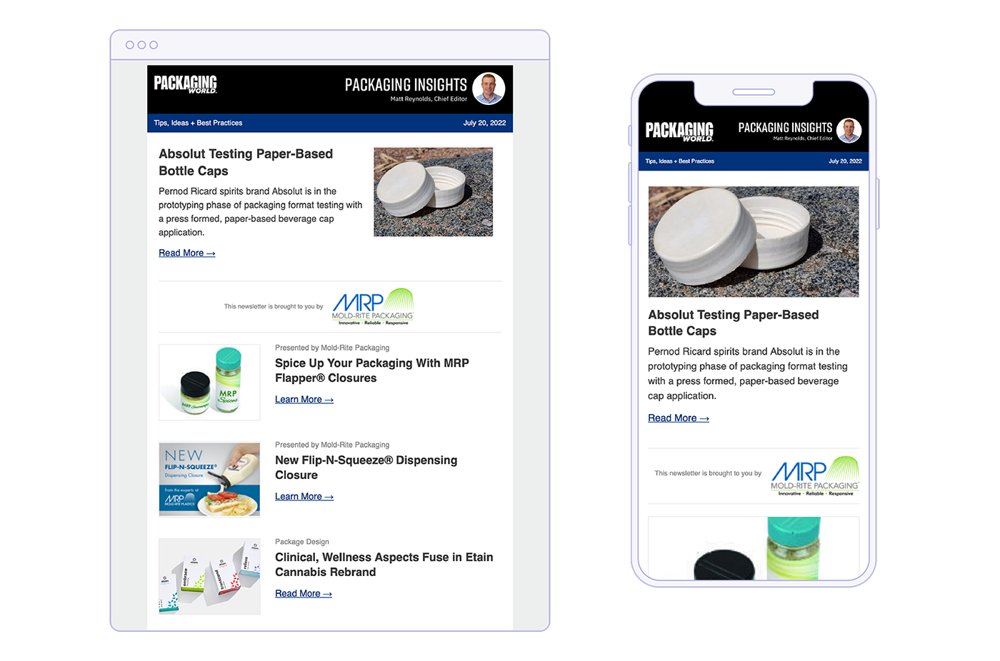
The suite of PMMI Media Group editorial newsletters is an ever-evolving product that remains one of its most profitable. With distribution to large audience lists covering topics of the packaging and processing machinery trade industry, the product team monetizes newsletters through lead generation and click-through rates to publication websites. The combination of flagging performance, a sorely needed design update, and flawed production workflow resulted in an overhaul of design, from aesthetics to workflow design. Challenges met on this project included sales team and client buy-in, and continued buy-in for further automation updates.
UI Design
Wireframing
Branding
HTML & CSS
2020
Individual effort
Shipped, no live example
PMMI Media Groups' newsletter performance was tanking across all facets in 2017. Click-through rates and lead performance were steadily dropping and production rendering errors were not getting better. In 2017, 75% of PMMI Media Group’s lead-generating email deployment types were not responsive and had been using designs and layouts that dated back as late as 2008 (not to mention, 22% of unique users visited on their mobile devices). The main goal of this project was to begin re-strategizing email products to help remedy click-through rates, and lead performance, and optimize mobile and production-related rendering errors.
I had full agency in producing designs and concepts for emails. I began by conducting B2B newsletter research, allowing myself to also draw from the more B2C. We audited our audience lists for the most popular email clients, operating systems, and devices, using this information to influence wireframing. We found that our mobile users were growing, something that was historically slow-growing in the B2B email space and our audience.
Additionally, we paid attention to ad ratios, as emails are one of our largest profit-generating products, and we needed to keep some sort of advertising in our emails.
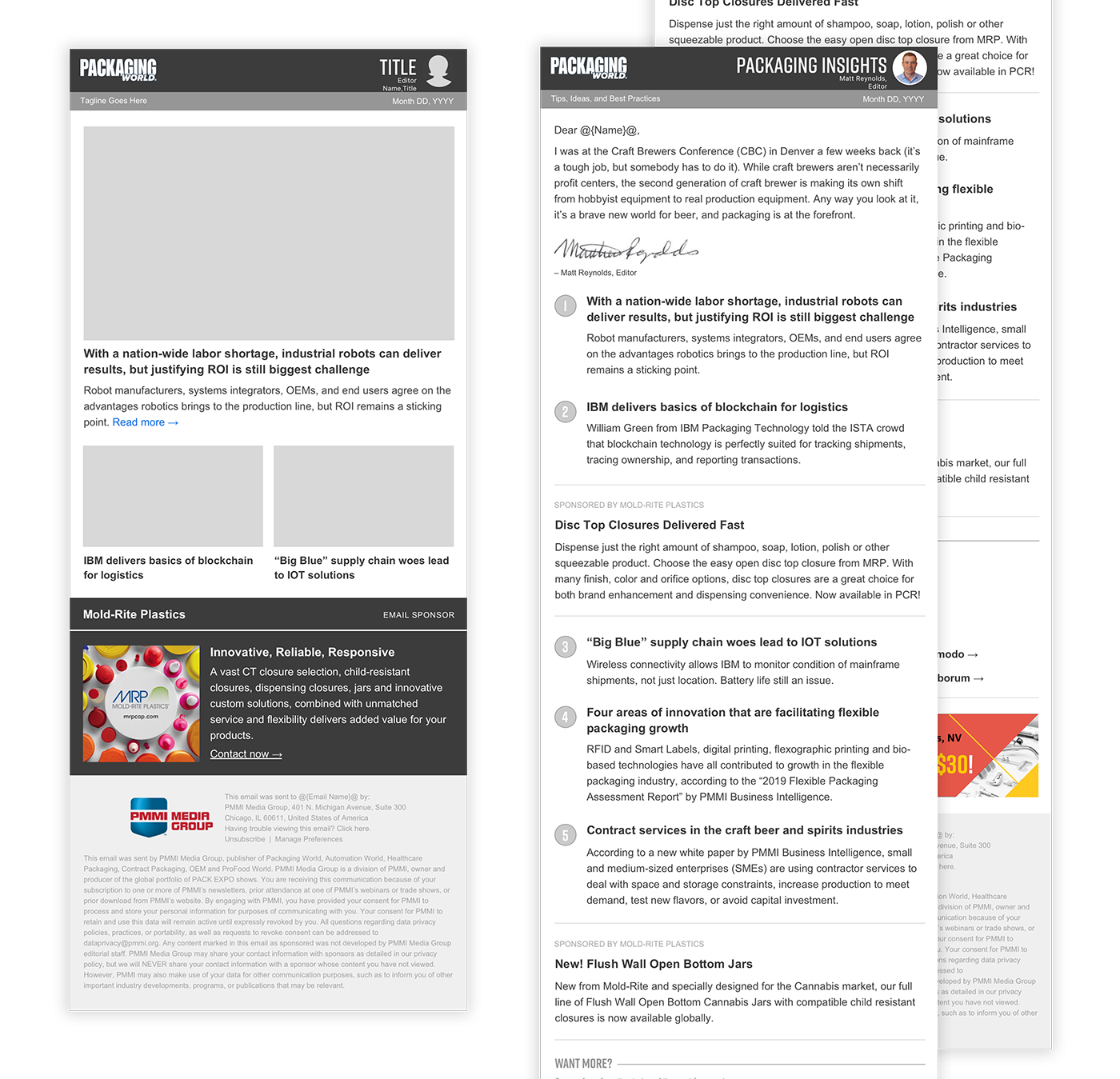
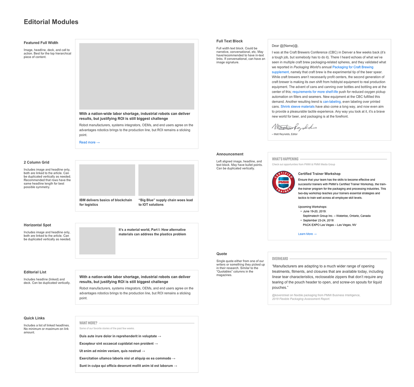
I began to wireframe, producing various examples of advertising and editorial ratios, with suggestions for new advertising strategies. In the end, I pushed for short, topical emails with low advertising, after researching that shorter newsletters had a better engagement.
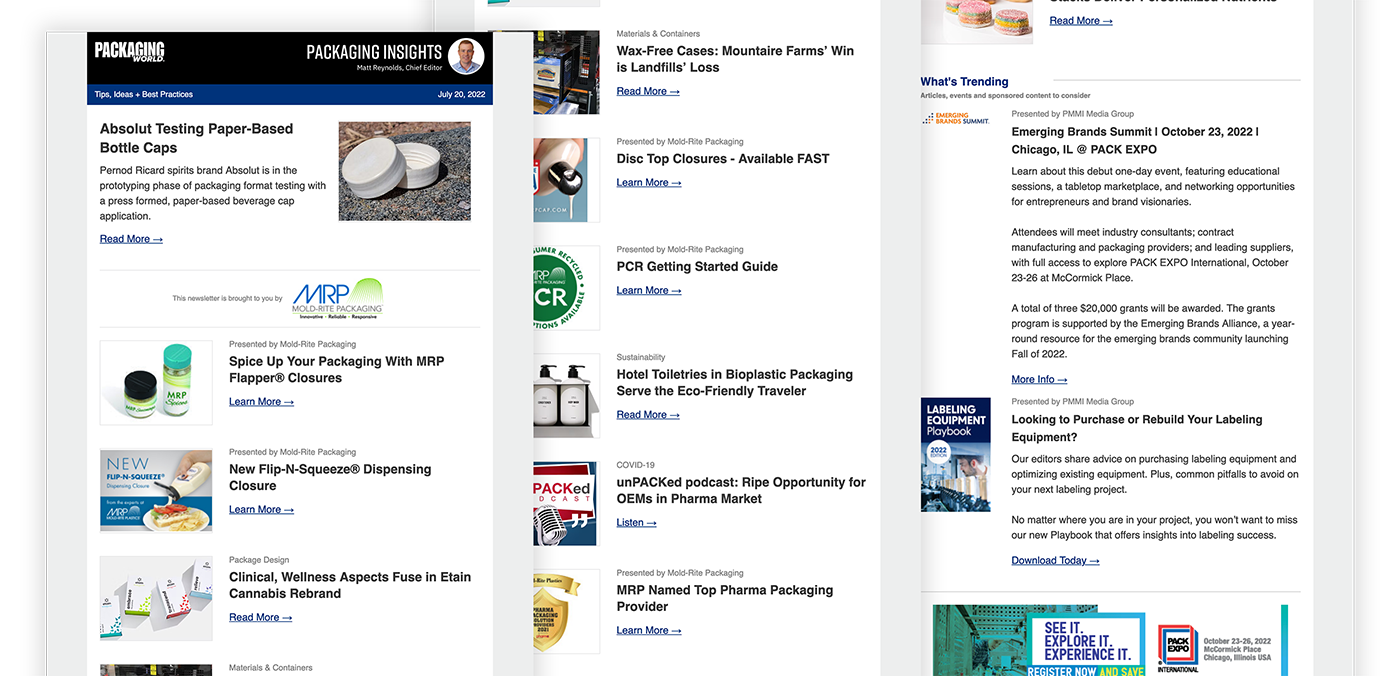
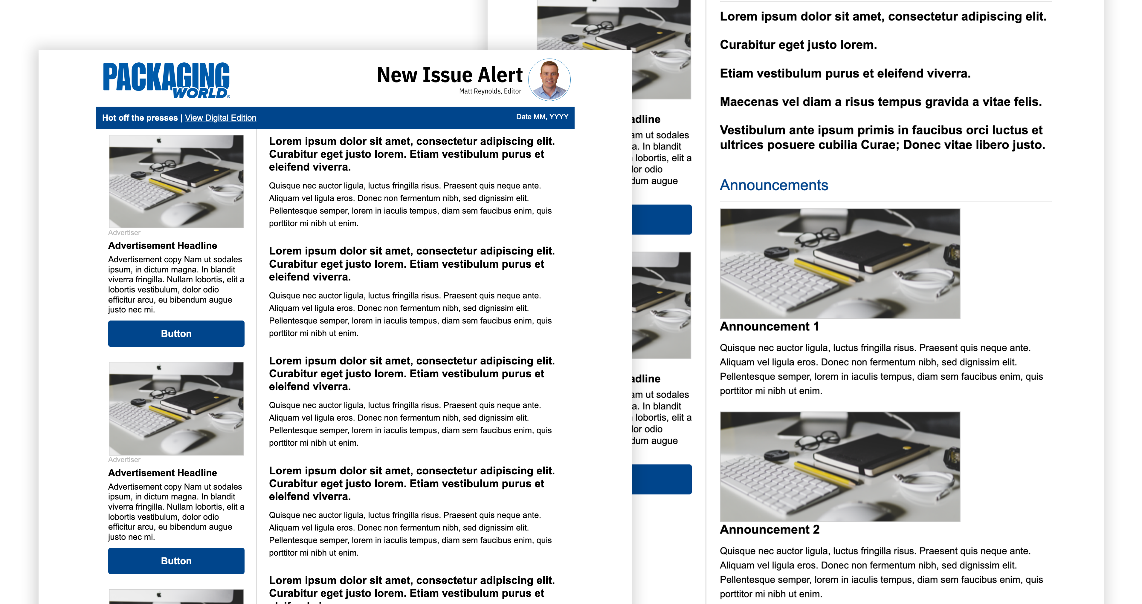
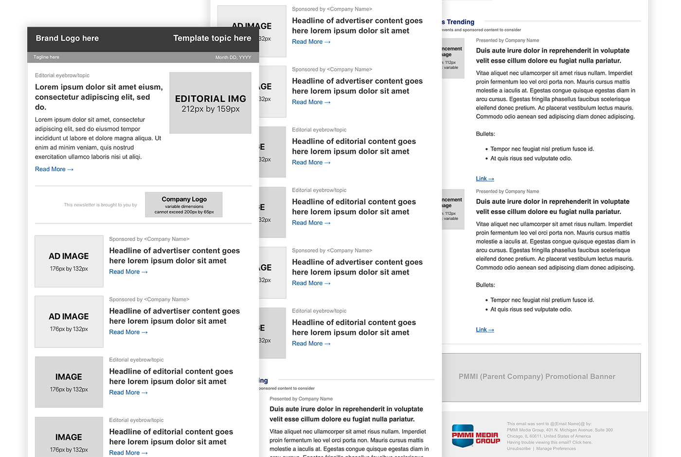
Up to this point, I had become familiar with the email coding process. I worked with our software developer, who was responsible for creating our compiling program, on the best practices to optimize the design for an automated process. Part of this was moving our emails to a narrower, one/two-column format, and making sure there was a clear delineation between separate blocks, components, and content types.
The color scheme was chosen by sampling colors from our websites. Former newsletters each had an individual brand and template header that in no way referenced the core magazine brands. The website schemes at the time had moved to a black header, with brand accent colors.
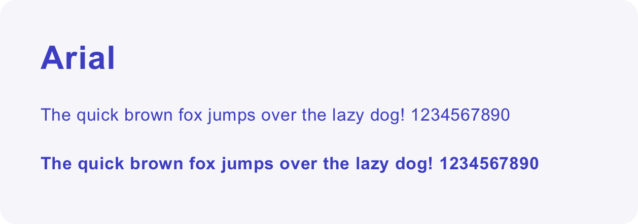
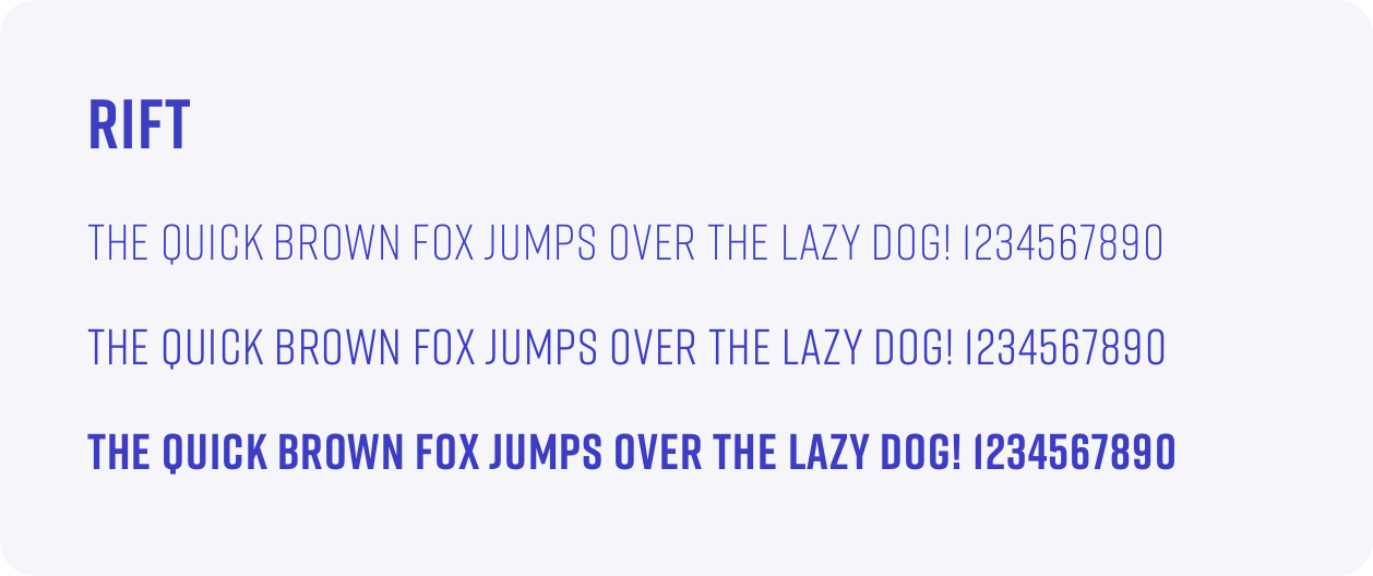
We chose to reference Rift in brand headers, but due to Webfont reliability issues in Outlook desktop clients (our largest audience segment), we chose to stick with Arial/sans-serif for the text body of the email.
The former ad ratio was about five ads to 12-15 pieces of editorial; however, most of that editorial was regurgitated "fluff". I wanted to push for less advertising and more poignant content, drastically reducing the ad ratio and placing a larger focus on quality editorial. Ultimately, clients and our sales team felt this change was too large, and the five ads remained with editorial reducing to eight instances.
The former standard of ad materials collection was to take whatever advertisers provided us and put it in our emails, no questions asked. Of course, this contributed to flailing lead-gen and click-through rates for advertisers, so to mitigate this, we embarked on client education to help them provide more aesthetic materials.
We revamped all brand topical long-form newsletters to be completely responsive. Simultaneously, the development team helped implement “eBuilder”, our email template compiler and ad collections tool that aided immensely in smoothing our production workflow process (see the project here!).