PMMI Media Group Marketing Website
A redesign of an existing marketing website to refine messaging to current and future advertising clients.
UI Design
Responsive Design
PMMI Media Group
An internal directory for product data.
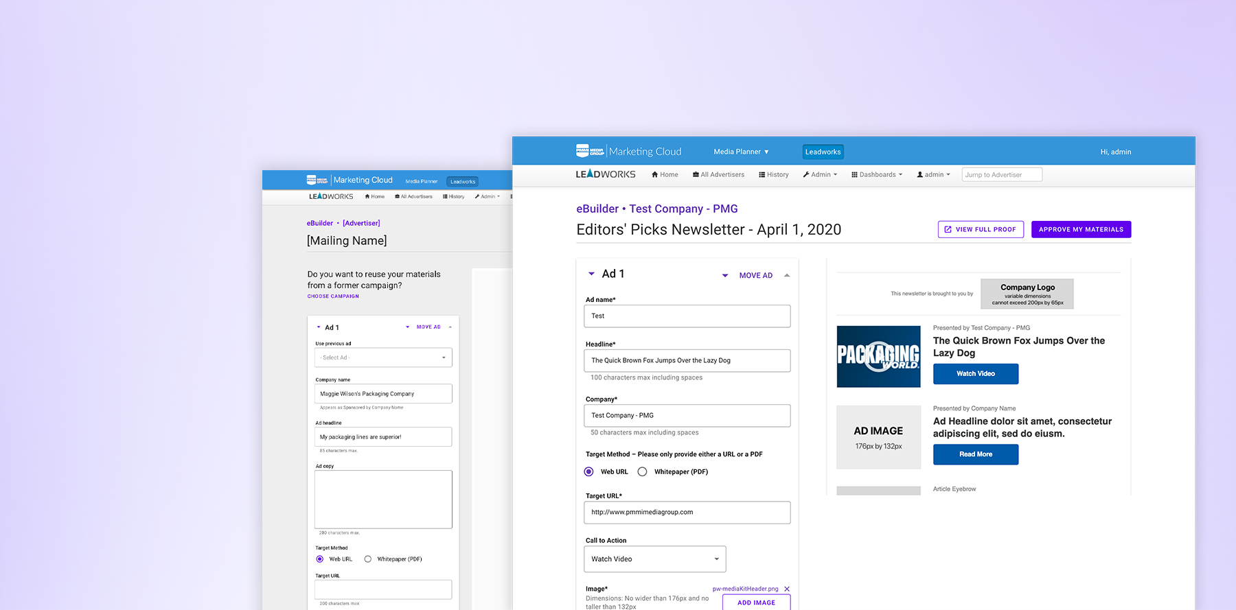
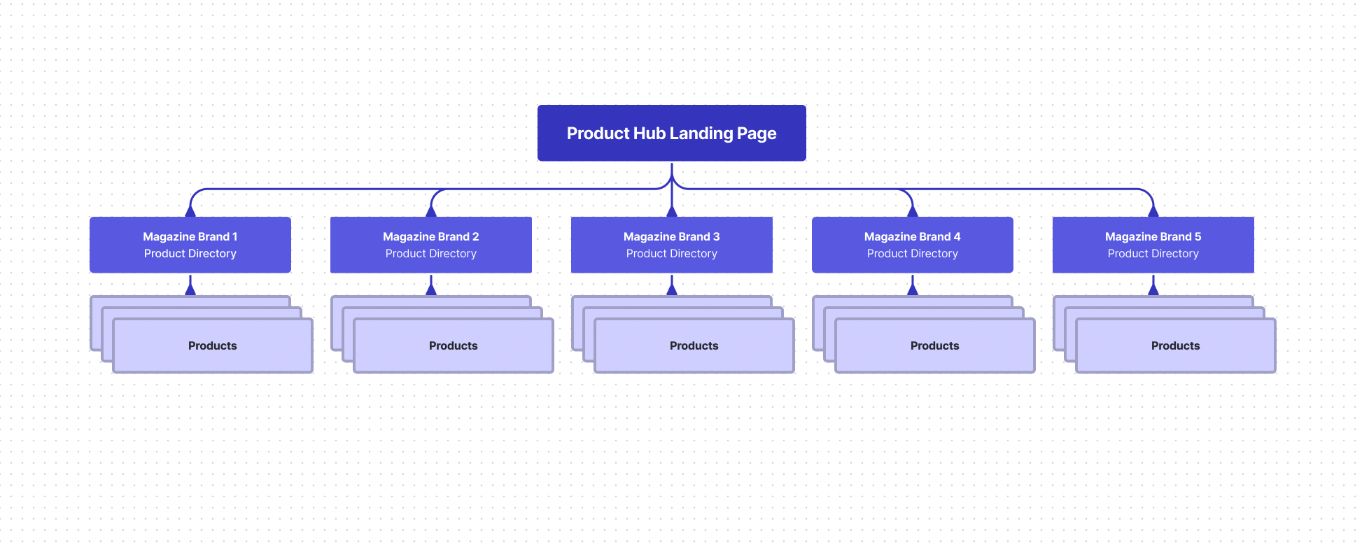
A sister to the Marketing Website project, the aptly named “Product Hub” would complete the marketing site overhaul by creating a separate, gated enterprise product directory. The directory would serve as a valuable resource for product owners, sales representatives, and marketing & operations, ultimately providing individual product details, sales highlights, and customer testimonials. The directory would be built into a CMS where product owners and other stakeholders could directly maintain, edit, and evaluate product details. Challenges met in this process included a shaky developer hand-off and a CMS vendor lacking overall usability.
UI Design
Wireframing
Branding
2019
David Newcorn, SVP of Digital and Data, Main Stakeholder
Alicia Pettigrew, Director, Product Strategy
Shipped, private tool
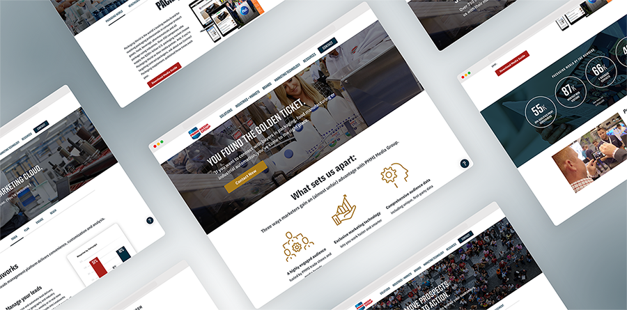
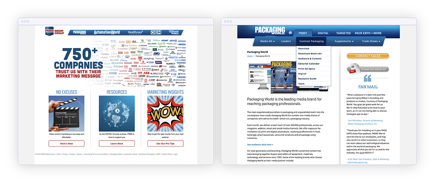
The original site had an ambiguous landing page with main navigation links to the company's flagship publications. Under each publication, a client or salesperson could access any information on print or digital advertising products and magazine publications.
As the suite of products grew, both across brands and brand agnostic products, the website grew into a confusing maze, posing both an organizational and cross-posting challenge for our marketing team responsible for updating the site.
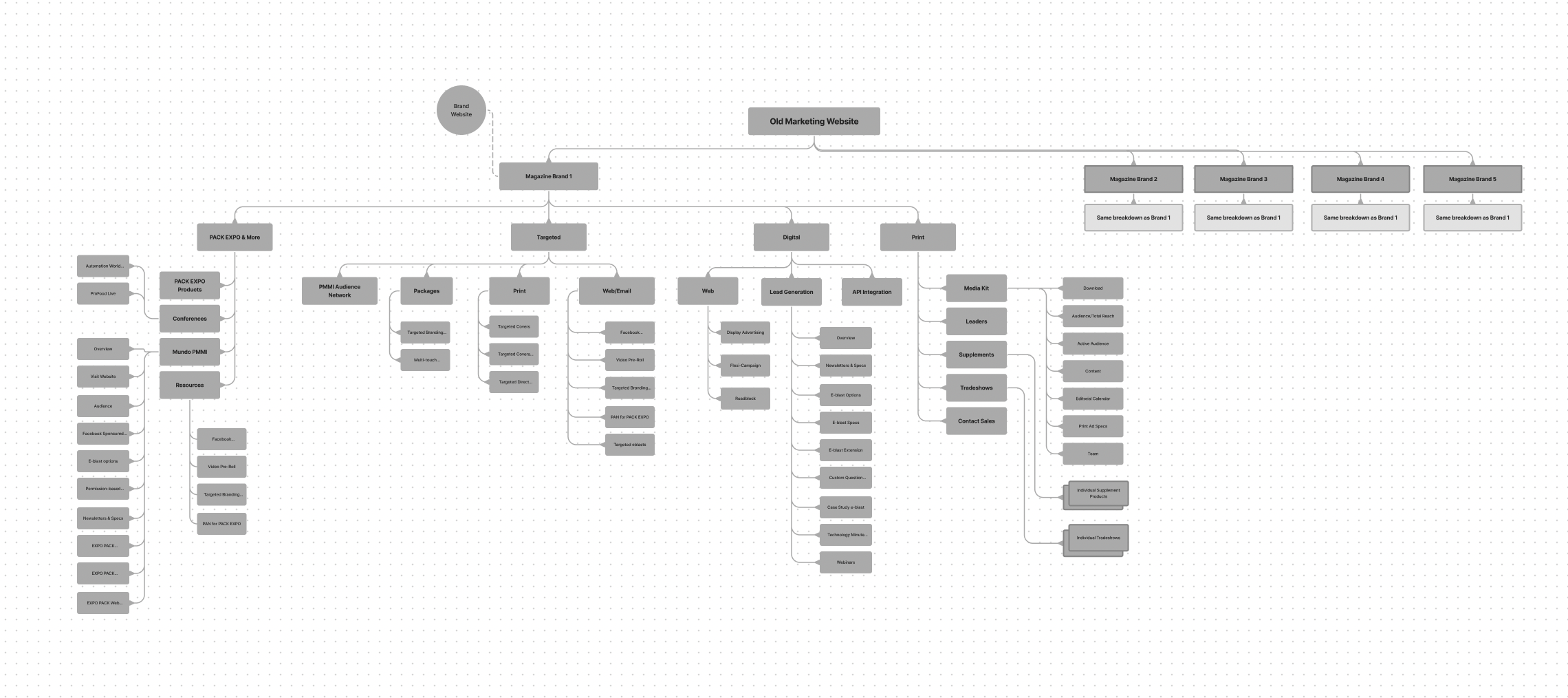
Really, we did not need to do a ton of restructuring for this site. At the core, the structure was similar to the original marketing site. I worked with our product manager and marketing team to identify a tagging system and the main terms products would be filtered by.
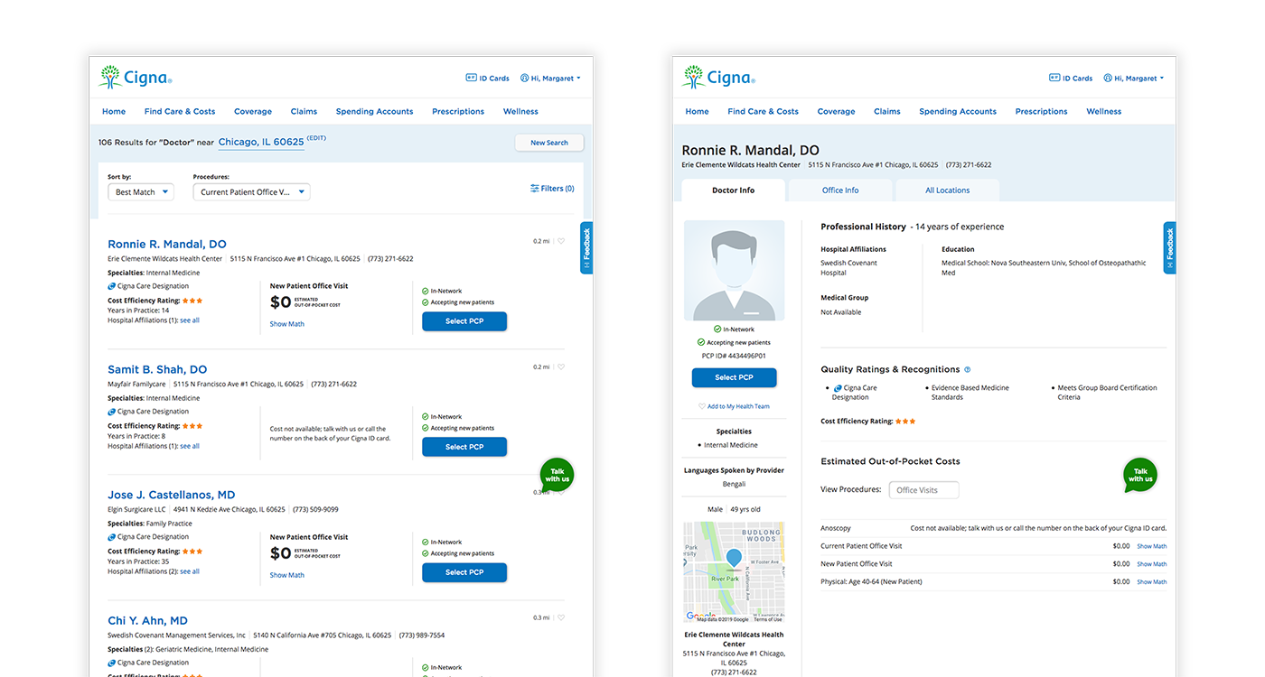
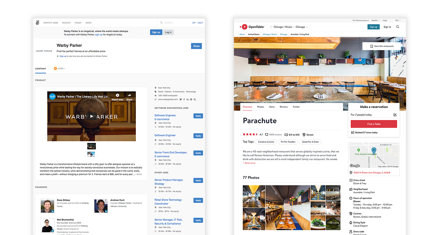
This was the first directory I had encountered, and since it was to function as a resource, my research mostly consisted of search and filter pages found on consumer product goods sites and other directories, like doctor searches, product searches, and libraries.
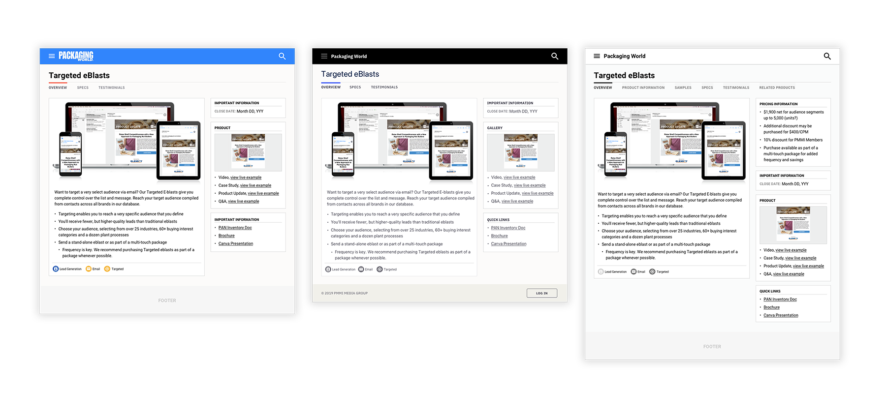
I started in the product page first and worked with our product manager to establish the layout for the product details page. No matter how we attacked it, we needed to include tabs, due to the detailed nature of our products.
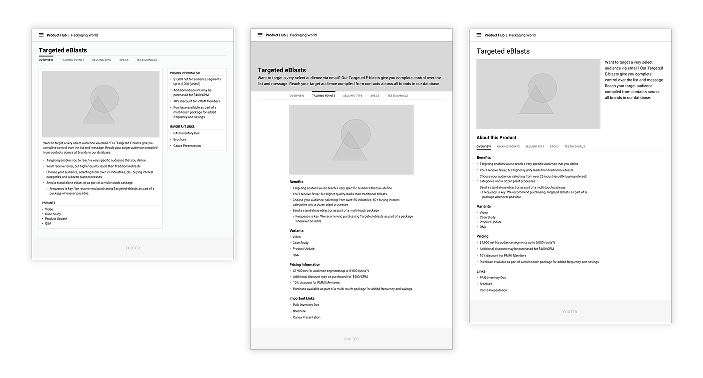
Once we landed on a layout, I explored color accents. Like I mentioned, this was to be a purely functional directory. The three options were a brand-specific color theme, a dark color theme (to match our newly re-launched brand websites), or a light theme, similar to the wireframe look. Ultimately the dark theme was chosen.
Color scheme was chosen by sampling colors from our logo. I then muted some of the colors to help modernize the site design. Being a media company, this was very important to the site design.
We chose the IBM Plex Sans font family as primary font for this site. Its taller x-height and large selection of weights allow for increased legibility and versatility.
For the UI, we chose a flat, layered look with cards/blocks in white over a light gray body. We sourced and created our own imagery, creating contextual mockups of products. Finally, we decided to incorporate the use of icons to denote product tags (goals, medium, etc.).
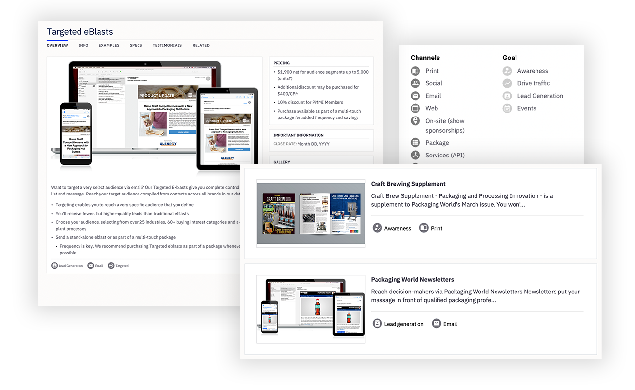
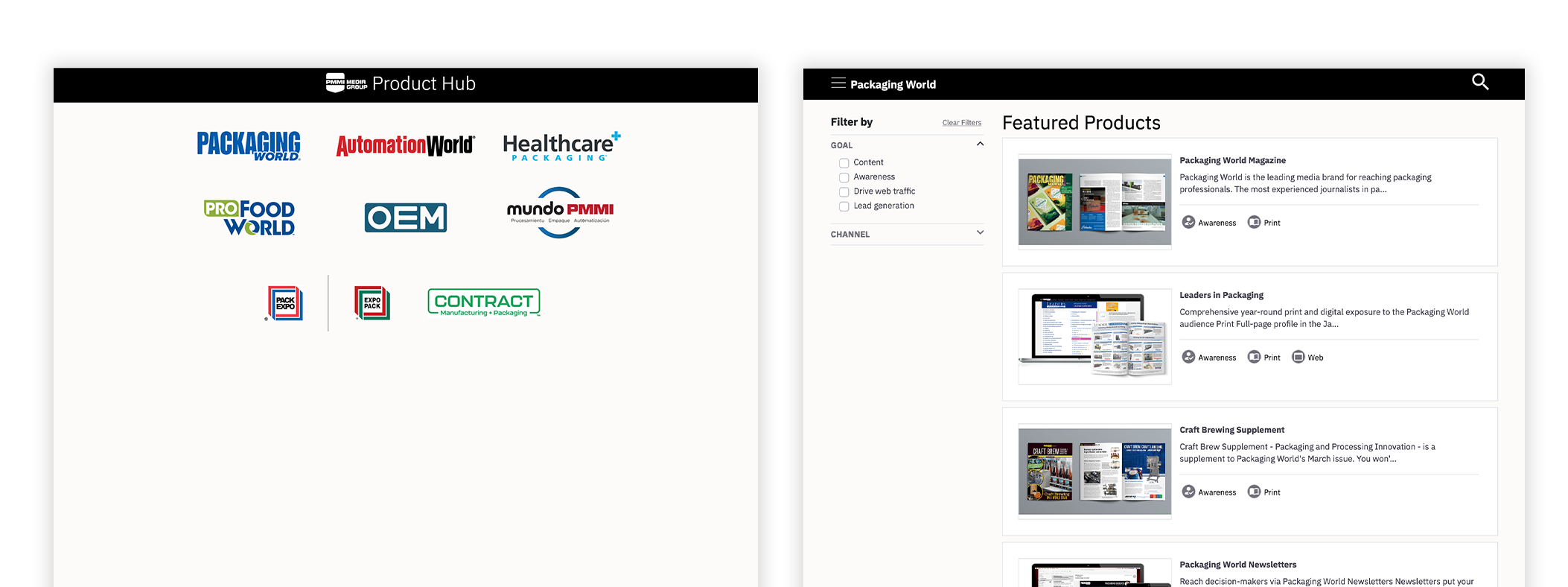
The brand gateway page would only be referenced by internal users, so the interface did not need to be very complex. After choosing a brand, you would land on its respective directory page with filters
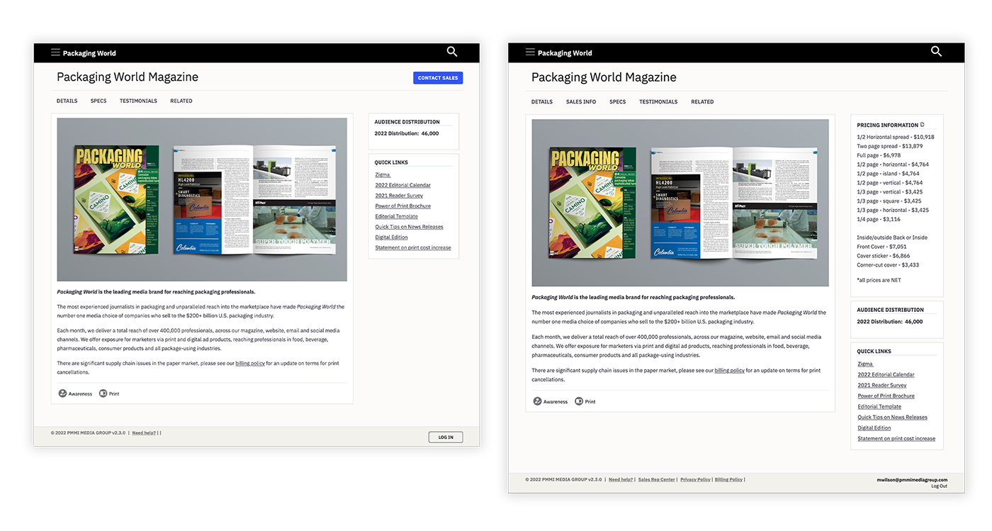
It was important to allow clients some access to the product hub. We wanted to permission pricing and other information to drive current and potential clients to have conversations with the sales team.
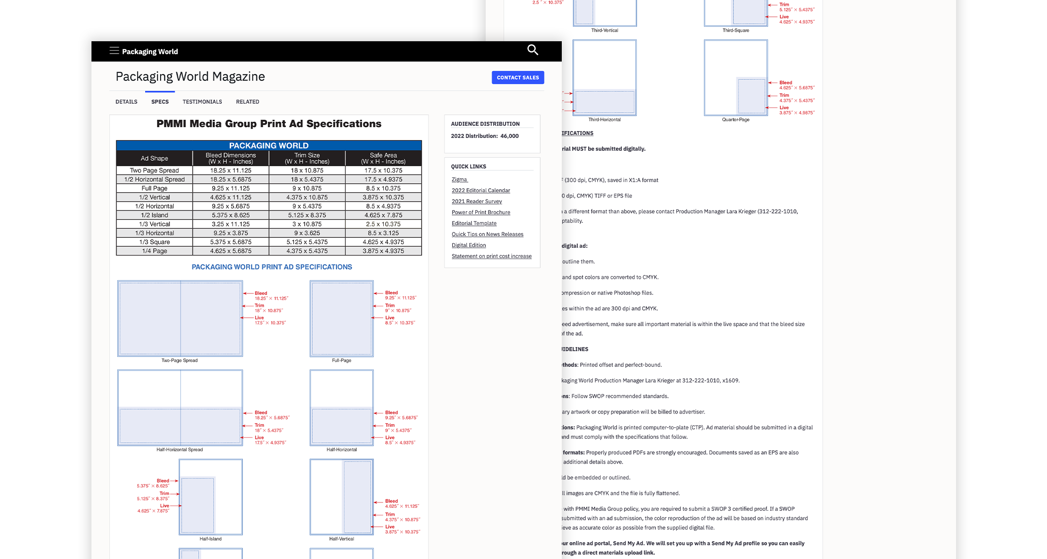
The specs tab was incredibly important for the client success team when it came to gathering materials and getting reference information for clients.