PMMI Media Group Product Hub
Enterprise product directory aiding sales and product teams in daily workflows.
UI Design
Responsive Design
PMMI Media Group
A redesign of an existing site to refine messaging to current and future clients.
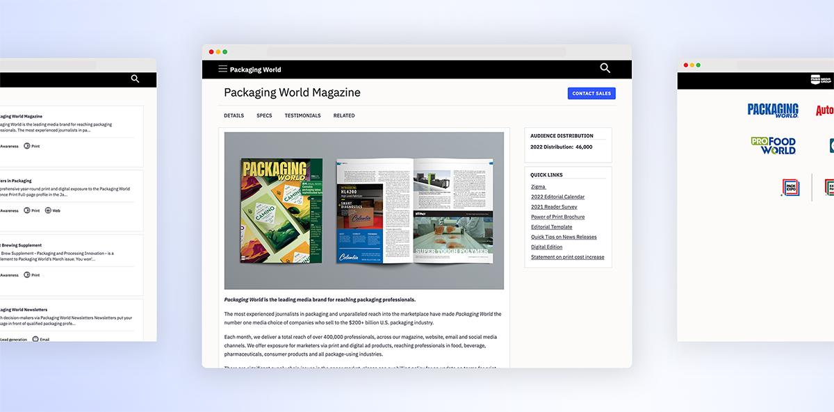
PMMI Media Group is a trade publishing company that serves the packaging manufacturing industry. It aimed to redesign its marketing website with the goal of separating its product library into a gated directory and creating a more traditional marketing website that would introduce prospective clients to the company and its offerings. See the product directory component here.
UI Design
Wireframing
Branding
2020
Sue DaMario, Director of Marketing
Amber Miller, Marketing Manager
Shipped, view live website
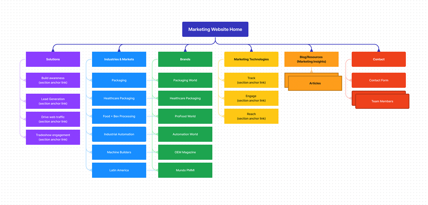
PMMI Media Group's marketing website initially lived as a complex company product directory that cohabitated with spare information about the company, its practices, and sub-brands. There was a glaring need to rethink content strategy, and simultaneously, an internal vendor audit revealed that the current CMS tool, Drupal, was actively draining internal developer resources and departmental budgets. Thus, stakeholders found the resolve to extricate valuable product information into a searchable, usable directory (the Product Hub), and rebirth the marketing website into a classic marketing website. A conscious decision was made to focus on the PMMI Media Group brand, and rework architecture to reduce redundancies.
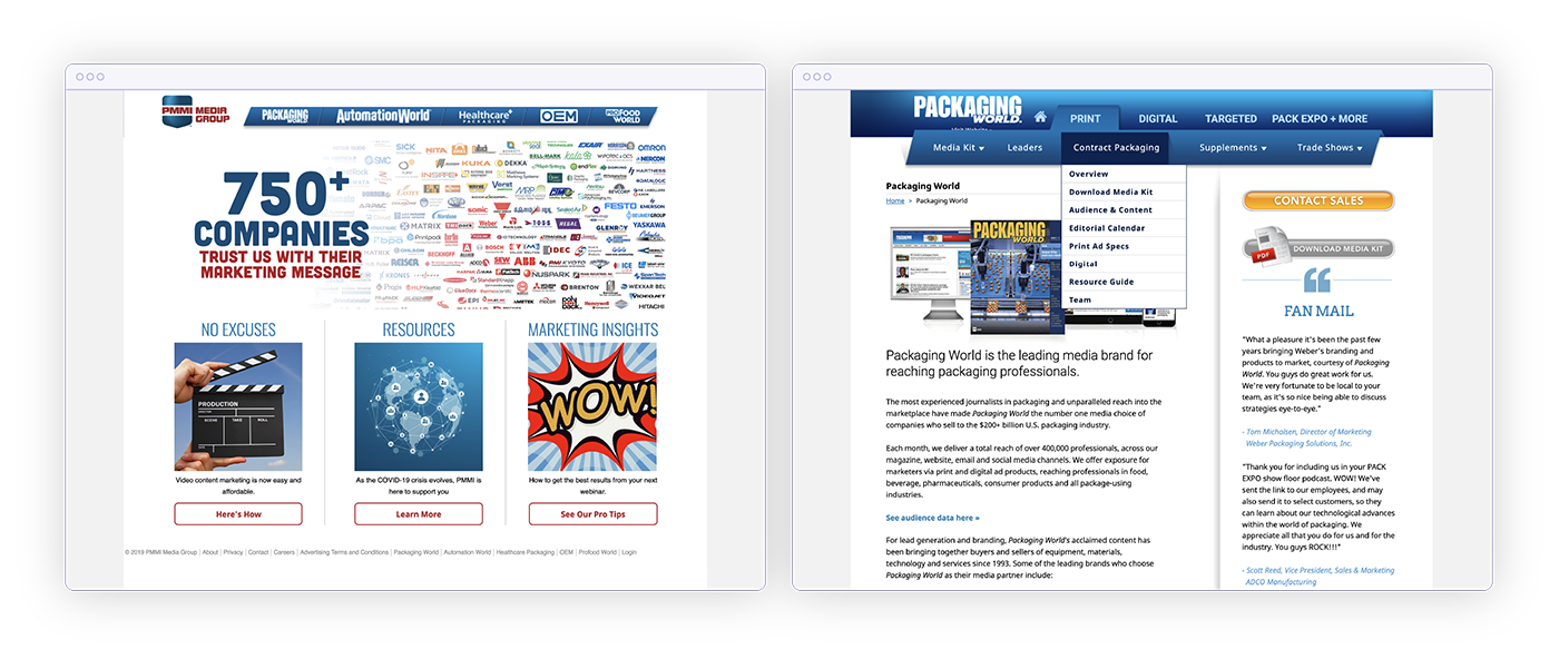
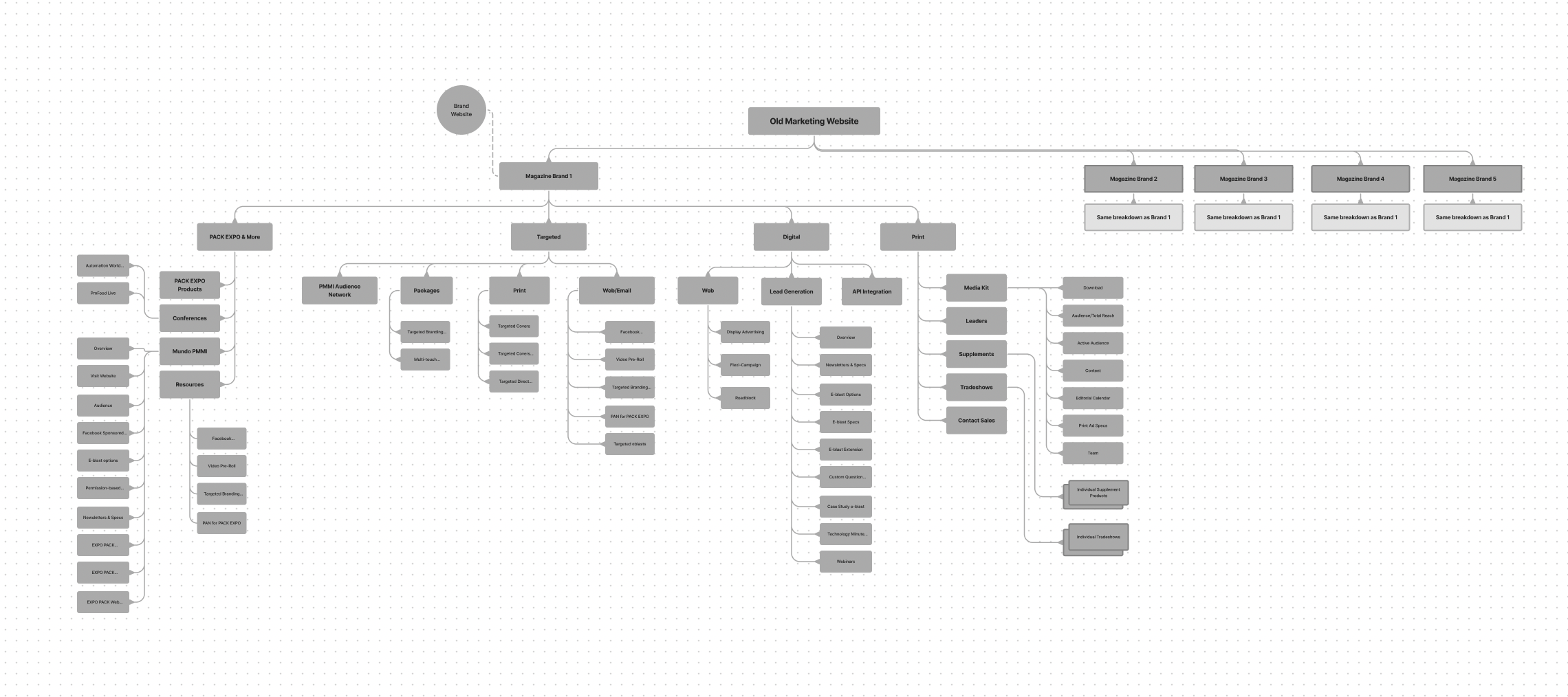
The design team—myself and my senior—worked with our client marketing team and product team to identify a strategy for the website, as the original website was broken down completely by our sub-brands, often causing duplicate product information. We mapped out a brand new architecture that was brand-agnostic and we created a content strategy that sold the big-picture of our products, rather than presenting every subatomic detail. On the other end of things, we worked closely with our product team to organize products and identify core properties for a tagging and filtering system that would ultimately inform a product directory (Product Hub!).
With the new content strategy, we began visually mapping out pages and curating a tone. I worked concurrently with our marketing team to help establish content tone.
I presented three mood board directions to our main stakeholders, and the logo-branded design won the vote. At the time, de-saturated primaries were trending in color palettes, and we opted for a condensed display font due to the technical nature of vocabulary when describing packaging technology. We felt these contributed to a more sophisticated look that matched the witty tone emerging from our copy, imbuing personality into a very technical trade.
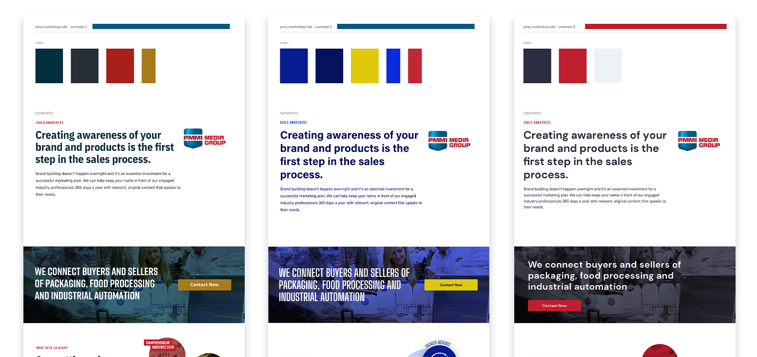
The color scheme was chosen by sampling colors from our logo. I then muted some of the colors to help modernize the site design. Being a media company, this was very important to the site design.
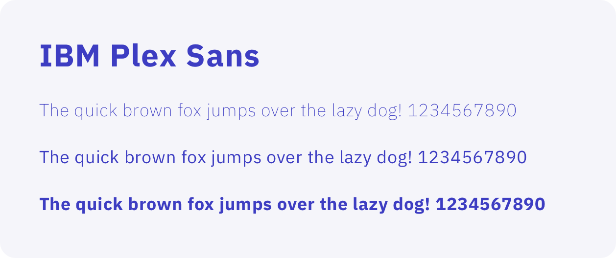
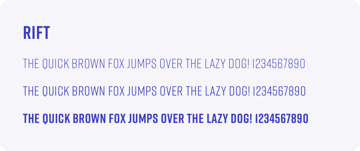
We chose the IBM Plex Sans font family as the primary font for this site. Its taller x-height and a large selection of weights allow for increased legibility and versatility. Additionally, we chose RIFT Display due to the longer-than-average length of terms specific to our industry.
We sourced imagery from our own licensed photo libraries, screenshots from native software (with altered PII!), and ultimately accents of line icons.
Initially, we contracted an agency to design and develop the project; however, their design team struggled to understand the nuances of our company's structure and strategy. In an effort to keep the project moving, we opted to move the design in-house, where I eventually won the project, and we contracted a development shop to program the website.
Incidentally, the pandemic had begun soon after the change in our creative direction. Higher-ups gutted the project budget, and hopes of contracted implementation were put on hold. In order to keep this project alive, I researched various lightweight CMS WYSIWYG-type tools and ultimately proposed Webflow as an option to host our new marketing website. Its CMS would easily support our content needs and the designer-friendly interface allowed me to create the website from scratch.
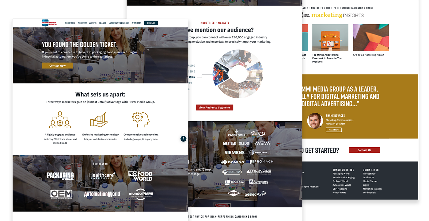
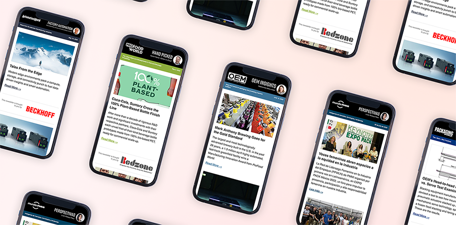
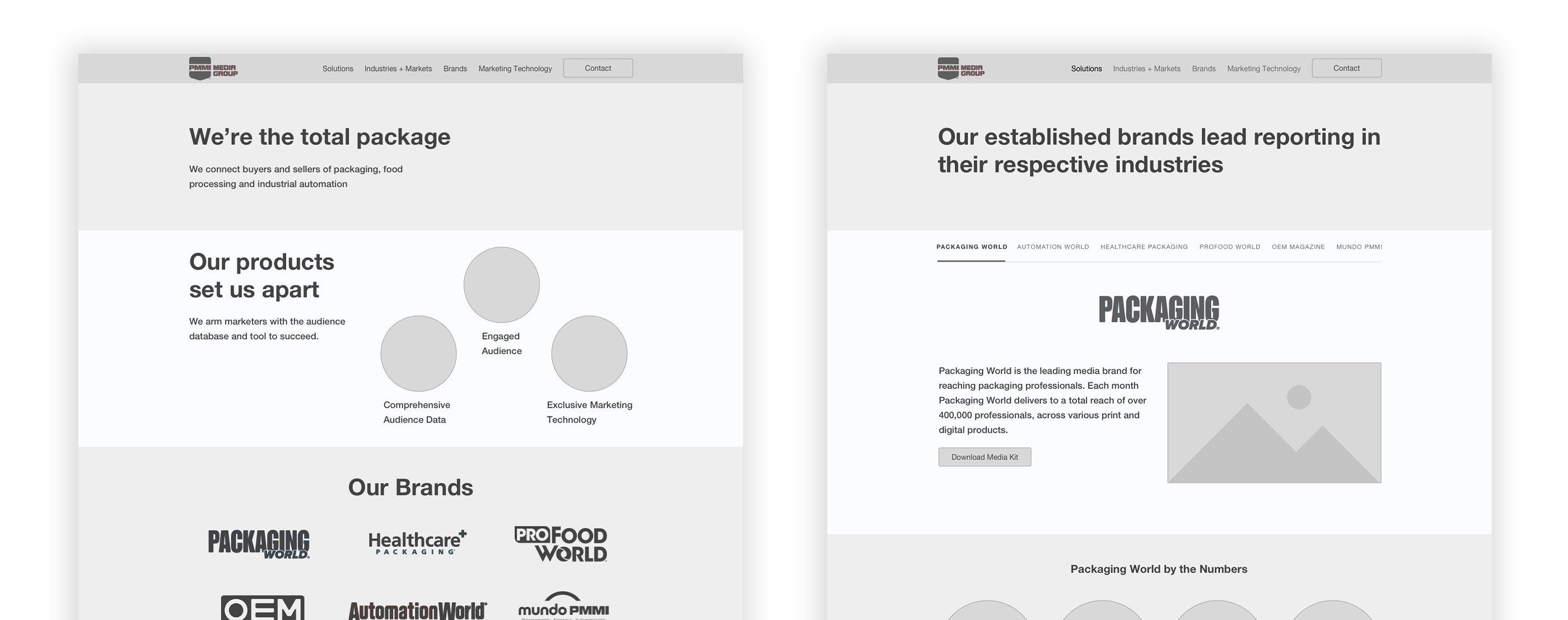
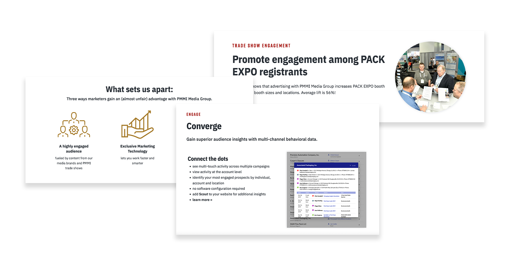
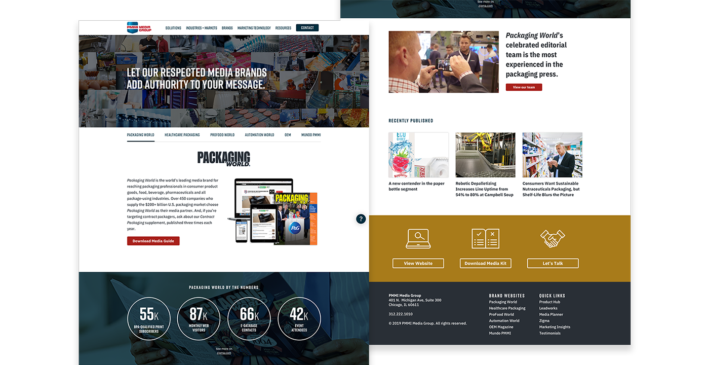
The home page showcased witty copy, yet also introduced the PMMI Media Group brand, strategy, and audiences. Since our suite of sub-brands is very well-known, it was important to keep those close to the top.
The brand page included stats, descriptions of vertical industries, and ways to get in touch to begin advertising.
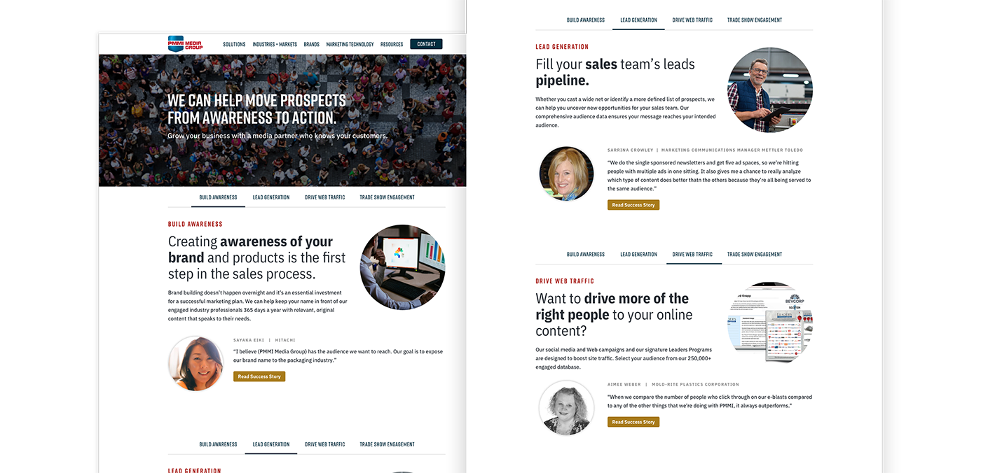
The solutions page is anchored around the four main goals a company might have when they begin a contract with us. Each goal is paired with a success story or testimonial.
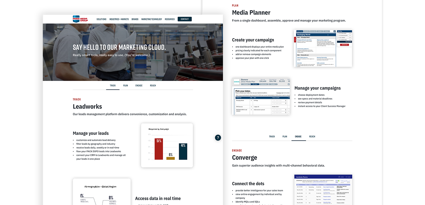
The marketing and technology page took inspiration from many software marketing sites—we wanted to show the data points that we offer.
This site was created out of the need to simplify our message to our clients and as the site has lived on, my peers and I felt we overcorrected in this strategy. Ultimately, we think more information about our company's products and audiences/markets would help fill in much-needed context. Additionally, branding efforts have been made to unify our brand with our parent company—this would ultimately call for a "reskin" of the website in the least.